Parksystems Website Renewal

Overview

The project focused on simplifying a previously complex information structure into a clear and intuitive experience, applying a consistent design system and responsive UI to optimize usability. Operational efficiency was also considered by improving the backend content management structure, leading to balanced improvements across both the frontend experience and the operational environment.

Global Website Renewal & AEM Publishing for UX/UI Experience

Client Park Systems
Date 2024
Type Website Renewal (Corporate Website)
Role UI Design (with UX Consideration), Front-end Publishing
Proposal

A concept design that communicates the product experience intuitively.

During the initial proposal phase, multiple directions were explored, presenting concepts that reflect Park Systems’ brand identity and global tone and manner. With a clear focus on strengthening product-led communication and creating a user-friendly browsing experience, the main visual and product lineup were organized into an intuitive structure, aiming to clearly convey the brand’s credibility and technical expertise.

Proposal key visual
Design System

A design system built on consistency and balance.

Typography, color, and grid systems were organized into a single, cohesive framework to strengthen both brand credibility and usability. Pretendard was selected as the core typeface to ensure stable readability in global environments, while generous spacing and a modular grid system were applied to create a clean and well-balanced layout. The overall tone and manner emphasizes global trust through blue and neutral gray, with aqua accents used as point colors to add a sense of vitality to the brand.

Typography

PARKSYSTEMS

PretendardRegular

ABCDEFGHIJKLMNOPQRSTUVWXYZ abcdefghijklmnopqrstuvwxyz
가나다라마바사아자차카타파하 각괄핥값같갚갛
1234567890 !@#$%^&*()_+-=

PARKSYSTEMS

PretendardMedium

ABCDEFGHIJKLMNOPQRSTUVWXYZ abcdefghijklmnopqrstuvwxyz
가나다라마바사아자차카타파하 각괄핥값같갚갛
1234567890 !@#$%^&*()_+-=

PARKSYSTEMS

PretendardBold

ABCDEFGHIJKLMNOPQRSTUVWXYZ abcdefghijklmnopqrstuvwxyz
가나다라마바사아자차카타파하 각괄핥값같갚갛
1234567890 !@#$%^&*()_+-=

Color
Primary#00AEE6
Primary Light#DFF4FB
White#FFFFFF
Secondary#2A3554
Tertiary#003A82
Black#000000
Gray 100
Gray 600
Gray 200
Gray 700
Gray 300
Gray 800
Gray 400
Gray 900
Gray 500
Gray 1000
Grid System
Grid system
Component & AEM Publishing

Publishing that brings together consistent UI components and operational efficiency.

Frequently used elements such as buttons, input fields, and cards were modularized into reusable components, allowing a consistent user experience and design tone to be maintained across the interface.
These components were integrated with AEM (Adobe Experience Manager)–based publishing, ensuring that the same rules and structural logic could be preserved and scaled within the operational environment. As a result, the principles defined in the design system were reliably implemented across the live service, enabling more flexible global site operations and content management.

Completion

A new experience where the brand meets the user.

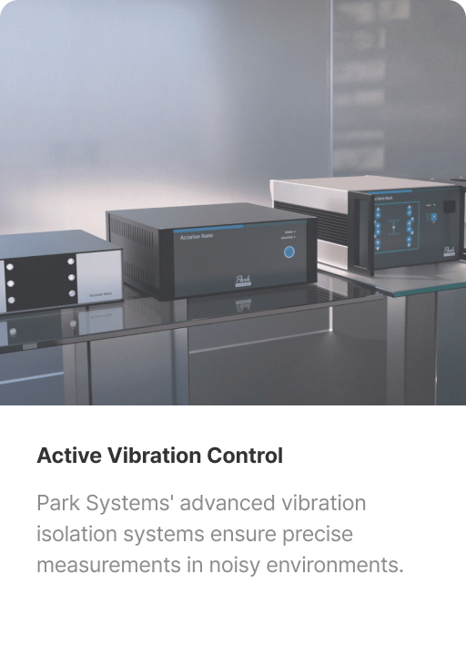
This renewal goes beyond building a website, extending Park Systems’ philosophy and values into an experience users can naturally feel.
Carefully considered spacing, balanced color usage, and interactions woven into a consistent flow convey the brand’s expertise and trust with subtle clarity. The website now moves beyond delivering information, becoming another face of Park Systems—one that connects with global customers through experience.

Parksystems Web site mockup
Showcase 1
Showcase 2
Showcase 3
Showcase 4